TRADERS’ TIPS
November 2025
For this month’s Traders’ Tips, the focus is Mohamed Ashraf and Mohamed Meregy’s article in this issue, “The Points & Line Chart.” Here, we present the November 2025 Traders’ Tips code with possible implementations in various software.
You can right-click on any chart to open it in a new tab or window and view it at it’s originally supplied size, often much larger than the version printed in the magazine.
The Traders’ Tips section is provided to help the reader implement a selected technique from an article in this issue or another recent issue. The entries here are contributed by software developers or programmers for software that is capable of customization.

TradeStation: November 2025
In the article “The Points & Line Chart” in this issue, Mohamed Ashraf and Mohamed Meregy introduce a new chart type designed to plot only significant price changes. Since plotting in TradeStation is tied to bars and there is no built-in way to create plot lines that exist independently of them, we can overlay a points & line (P&L) chart on a regular OHLC chart.
The lines connecting the points do not represent the P&L value at every moment; they are simply drawn to connect the discrete, true P&L points and illustrate the time between them. The EasyLanguage code provided here implements the default method for defining the point size needed to move to a new point in the same direction.
A sample chart in TradeStation is shown in Figure 1.
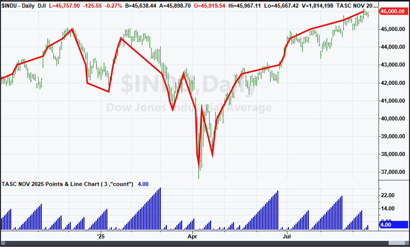
FIGURE 1: TRADESTATION. This is a daily chart of the Dow Jones Industrial Average showing a portion of 2024 and 2025 with the indicator applied twice, once to show the line and a second time to show the number of days associated with each P&L point.
Indicator: The Points & Line Chart

{
	TASC NOV 2025
	Points & Line Chart
	Mohamed Ashraf and Mohamed Meregy
}

inputs:
	ReversalAmount( 3 ),
	PlotStyle( "line" ); // "line", "count" or "volume"

variables:
	Dir( 1 ),
	BarCount( 0 ),
	PLBoxSize( 0 ),
	BasePrice( 0 ),
	LastPLPrice( 0 ),
	Vol( 0 ),
	VolSum( 0 );

PLBoxSize = Iff( Close < 0.25, 0.025,
 Iff( Close >= 0.25 and Close < 0.5, 0.05,
 Iff( Close >= 0.5 and Close < 1, 0.1,
 Iff( Close >= 1 and Close < 5, 0.25,
 Iff( Close >= 5 and Close < 20, 0.5,
 Iff( Close >= 20 and Close < 100, 1,
 Iff( Close >= 100 and Close < 200, 2,
 Iff( Close >= 200 and Close < 500, 5,
 Iff( Close >= 500 and Close < 1000, 10,
 Iff( Close >= 1000 and Close < 2000, 20,
 Iff( Close >= 2000 and Close < 5000, 50,
 Iff( Close >= 5000 and Close < 10000, 100,
 Iff( Close >= 10000 and Close < 20000, 200,
  500 ))))))))))) ) );

BasePrice = Floor( Close / PLBoxSize ) * PLBoxSize;

if CurrentBar = 1 then
begin
	if PlotStyle.ToLower() = "line" then
		Plot1( BasePrice, "P&L Line" );

	VolSum = Vol;
	LastPLPrice = BasePrice;
	BarCount = 0;
	Dir = 1;
end
else
begin
	if Dir = 1 then
	begin
		if BasePrice >= LastPLPrice + PLBoxSize then
		begin
			if PlotStyle.ToLower() = "line" then
				Plot1( BasePrice, "P&L Line" );

			VolSum = Vol;
			LastPLPrice = BasePrice;
			BarCount = 1;
		end
		else if Close <= LastPLPrice
		 - (PLBoxSize * ReversalAmount) then
		begin
			if PlotStyle.ToLower() = "line" then
				Plot1( BasePrice, "P&L Line" );

			LastPLPrice = BasePrice;
			VolSum = Vol;
			BarCount = 1;
			Dir = -1;
		end
		else
		begin
			VolSum += Vol;
			BarCount += 1;
		end;
	end
	else if Dir = -1 then
	begin
		if BasePrice <= LastPLPrice - PLBoxSize then
		begin
			if PlotStyle.ToLower() = "line" then
				Plot1( BasePrice, "P&L Line" );

			LastPLPrice = BasePrice;
			VolSum = Vol;
			BarCount = 1;
		end
		else if Close >= LastPLPrice
		 + (PLBoxSize * ReversalAmount) then
		begin
			if PlotStyle.ToLower() = "line" then
				Plot1( BasePrice, "P&L Line" );

			LastPLPrice = BasePrice;
			VolSum = Vol;
			BarCount = 1;
			Dir = 1;
		end
		else
		begin
			VolSum += Vol;
			BarCount += 1;
		end;
	end;
end;

if PlotStyle.ToLower() = "count" then
	Plot2( BarCount, "P&L Count" )
else if PlotStyle.ToLower() = "volume" then
	Plot3( VolSum, "P&L Volume" );
This article is for informational purposes. No type of trading or investment recommendation, advice, or strategy is being made, given, or in any manner provided by TradeStation Securities or its affiliates.
—John Robinson
TradeStation Securities, Inc.
www.TradeStation.com
BACK TO LIST

Wealth-Lab.com: November 2025
We have added the points & line chart style (based on Mohamed Ashraf and Mohamed Meregy’s article in this issue, “The Points & Line Chart,” which introduces the chart style) to the WealthLab Trend Chart Styles Extension. This extension also contains other irregular time series chart styles including point & figure, kagi, renko, and line break.
In WealthLab, a chart style is an extensible object. To create a new chart style, a developer can use a .NET dev tool such as Visual Studio and create a new class that descends from ChartStyleBase which is part of the WealthLab framework. By overriding various virtual methods like Initialize and Render, a complete custom chart style can be implemented, allowing you to render the chart in whatever scheme you might imagine.
Following is the code for our points & line chart style, complete with parameters that allow you to change the point size and the number of days required for a reversal. Our class uses object-oriented programming to leverage the rendering of the preexisting LineChartStyle class.
using System;
using System.Collections.Generic;
using System.Linq;
using System.Text;
using System.Threading.Tasks;
using System.Windows.Media;
using WealthLab.ChartWPF;
using WealthLab.Core;

namespace WealthLab.TrendChartStyles
{
    //Point and Line Chart Style from TASC November 2025
    public class PointAndLineStyle : LineChartStyle
    {
        //parameters
        public override void GenerateParameters()
        {
            Parameters.Clear();
            AddParameter("Thickness", ParameterType.Int32, 2);
            AddParameter("Line Style", ParameterType.LineStyle, LineStyle.Solid);
            AddParameter("Box Size", ParameterType.Double, 1.0);
            AddParameter("Reversal Boxes", ParameterType.Int32, 3);
        }

        //name
        public override string Name => "Point & Line";

        //glyph
        public override string GlyphResource => "WealthLab.TrendChartStyles.WPF.Glyphs.Line.png";

        //use cumulative volume
        public override bool UseCumulativeVolume => true;

        //not a simple style
        public override bool IsSimpleStyle => false;

        //initialize
        public override void Initialize(BarHistory bars)
        {
            if (bars.Count == 0)
                return;
            double boxSize = Parameters[2].AsDouble;
            int boxReversals = Parameters[3].AsInt;
            bool goingUp = true;
            bool goingDown = true;
            double lastPlotted = bars.Close[0];
            _barsPlotted.Clear();
            _barsPlotted.Add(false);
            for(int n = 1; n < bars.Count; n++)
            {
                if (goingDown && goingUp)
                {
                    //initial state, check for first bar to render
                    double distance = Math.Abs(bars.Close[n] - lastPlotted);
                    if (distance >= boxSize)
                    {
                        goingUp = bars.Close[n] >= lastPlotted;
                        goingDown = !goingUp;
                        _barsPlotted.Add(true);
                        lastPlotted = bars.Close[n];
                    }
                    else
                        _barsPlotted.Add(false);
                }
                else if (goingUp)
                {
                    if (bars.Close[n] >= lastPlotted + boxSize)
                    {
                        _barsPlotted.Add(true);
                        lastPlotted = bars.Close[n];
                    }
                    else if (bars.Close[n] <= lastPlotted - boxSize * boxReversals)
                    {
                        _barsPlotted.Add(true);
                        lastPlotted = bars.Close[n];
                        goingDown = true;
                        goingUp = false;
                    }
                    else
                        _barsPlotted.Add(false);
                }
                else
                {
                    if (bars.Close[n] <= lastPlotted - boxSize)
                    {
                        _barsPlotted.Add(true);
                        lastPlotted = bars.Close[n];
                    }
                    else if (bars.Close[n] >= lastPlotted + boxSize * boxReversals)
                    {
                        _barsPlotted.Add(true);
                        lastPlotted = bars.Close[n];
                        goingUp = true;
                        goingDown = false;
                    }
                    else
                        _barsPlotted.Add(false);
                }
            }
        }

        //get a bar width, it's either zero (unplotted) or chart's bar spacing
        public override double GetBarWidth(int idx)
        {
            return _barsPlotted[idx] ? ChartPreferences.BarSpacing : 0.0;
        }

        //private members
        private List<bool> _barsPlotted = new List<bool>();
    }
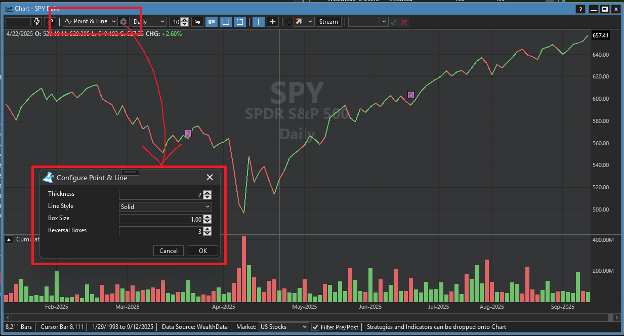
FIGURE 2: WEALTH-LAB. An example of configuring a points & line display is demonstrated on a daily chart of SPY. The WealthLab Trend Chart Styles Extension is used, since in WealthLab, a chart style is an extensible object. Parameters allow the user to change the point size and the number of days required for a direction change.
—Dion Kurczek
www.wealth-lab.com
BACK TO LIST

NinjaTrader: November 2025
In the article “The Points & Line Chart” in this issue, Mohamed Ashraf and Mohamed Meregy present a chart style they named the points & line (P&L) chart.
A file has been created to help the user implement several of the possible configurations in the P&L chart style (the default, ATR, and percent box sizing) and is available for download at the following link for NinjaTrader 8:
Once the file is downloaded, you can import it into NinjaTrader 8 from within the control center by selecting Tools → Import → NinjaScript Add-On and then selecting the downloaded file for NinjaTrader 8.
You can review the source code in NinjaTrader 8 by selecting New → NinjaScript Editor → Indicators from within the control center window and selecting the file.
A sample chart is shown in Figure 3.
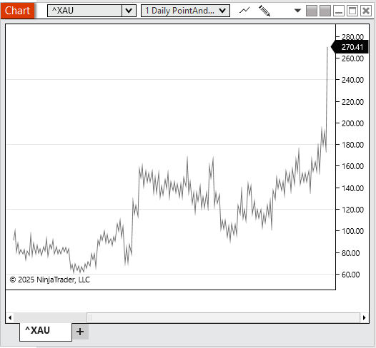
FIGURE 3: NINJATRADER. An example of plotting a points & line display in NinjaTrader is demonstrated here on a chart of XAU.
NinjaScript uses compiled DLLs that run native, not interpreted, to provide you with the highest performance possible.
—NinjaTrader Eduardo
NinjaTrader, LLC
www.ninjatrader.com
BACK TO LIST

TradingView: November 2025
The TradingView Pine Script code (shown below) implements the points & line chart style as introduced in the article in this issue by Mohamed Ashraf and Mohamed Meregy titled “The Points & Line Chart.”
//  TASC Issue: November 2025
//     Article: Efficient Display Of Irregular Time Series
//              The Points & Line Chart
//  Article By: Mohamed Ashraf Mahfouz, CETA, CFTe, MFTA
//              Mohamed Meregy, CETA, CFTe
//    Language: TradingView's Pine Script® v6
// Provided By: PineCoders, for tradingview.com


//@version=6
indicator("TASC 2025.11 The Points and Line Chart", "P&L",
 overlay = false,
 max_lines_count = 500,
 max_boxes_count = 500,
 max_labels_count = 500)

//#region   UDTs:

// @type Candle Data Type
type candle
    float o
    float h
    float l
    float c
    float v
    int t
    int d

// @enum Scale size Method
enum SCALE
	Default
	ATR
	Percent

// @enum P&L filtration method
enum METHOD
	Point = "Point Size"
	HL = "High Low"
	Close = "Close"

// @enum P&L Price Display
enum PD
    Line
    Candles
    None

// @enum Data Display
enum DD
    Volume
    Days
    None

//#endregion
//#region   Inputs:

GROUP1 = "P&L Calculation Settings"

int rxValue = input.int(3,
 title = "Reversal Amount:",
 minval = 1,
 maxval = 20,
 tooltip = "The number of points required for direction to change!",
 group = GROUP1)

SCALE scaleType = input.enum(SCALE.Default,
 title = "Scale size Method:",
 tooltip = "Method for filtering price moves.",
 inline = "st", group = GROUP1)

int atrLength = input.int(14, "",
 minval = 1,
 tooltip = "ATR Length.",
 inline = "st",
 active = scaleType==SCALE.ATR?true:false,
 group = GROUP1)

float percentage = input.float(1.0,
 title = "",
 minval = 0.5,
 maxval = 50,
 step = 1,
 tooltip = "Percentage value to be used when box range type is `Percentage`.",
 inline = "st",
 active = scaleType == SCALE.Percent ? true : false,
 group = GROUP1)

METHOD iMethod = input.enum(METHOD.Point, "P&L Method:",
 tooltip = "Method for calculating P&L prices.",
 group = GROUP1)


GROUP2 = "Display Settings"

bool onChart = input.bool(true, title = "Overlay P&L on Chart",
 group = GROUP2)
PD priceDisplay = input.enum(PD.Line, title = "Price Display",
 group = GROUP2)
DD dataDisplay = input.enum(DD.Volume, title = "Data Display",
 group = GROUP2)

//Colors
color C1 = color.blue
color C2 = color.green
color C3 = color.red

//#endregion
//#region   Functions:

// @function        Rounds number to nearest input number.
// @param           Base Number.
// @param           Step size rounded to.
// @returns         Rounded Number.
roundTo(_round,_to) =>
    math.round(_round/_to)*_to

// @function        Formats candle data into string for display as tooltip.
// @param           Candle UDT input.
// @returns          String of formatted candle data.
formatTT(candle _candle) =>
    date = str.format_time(_candle.t, "MM/dd/yy HH:mm")
    d = str.tostring(_candle.d)  + " Day" + (_candle.d == 1 ? "" : "s")
    o = "O: " + str.tostring(_candle.o,format.mintick)
    h = "H: " + str.tostring(_candle.h,format.mintick)
    l = "L: " + str.tostring(_candle.l,format.mintick)
    c = "C: " + str.tostring(_candle.c,format.mintick)
    v = "V: " + str.tostring(_candle.v,format.volume)

    date + "\n" + d + "\n" + o + "\n" + h + "\n" + l + "\n" + c + "\n" + v

// @function        Draws a candle on the chart using 2 Lines.
// @param _candle   Candle UDT input
// @param _t        x value (time) of candle
// @param  _fo      Force Overlay
// @returns         void
drawCandle(candle _candle, int _t, bool _fo) =>
    col = _candle.c > _candle.o ? C2 : C3
    if _fo
        line.new(_t,_candle.h,_t,_candle.l,
         xloc = xloc.bar_time, width = 1, force_overlay = true, color = col)

        box.new(_t,_candle.o,_t,_candle.c,
         xloc = xloc.bar_time,
         force_overlay = true,
         border_color = col,
         border_width = 3)

    else
        line.new(_t,_candle.h,_t,_candle.l,
         xloc = xloc.bar_time, width = 1, color = col)

        box.new(_t,_candle.o,_t,_candle.c,
         xloc = xloc.bar_time,
         border_color = col,
         border_width = 3)

//#endregion
//#region   Variables:

var LIMITS = array.from(0.25, 0.5, 1, 5, 20, 100, 200, 500, 1000, 2000, 5000, 10000, 20000, 10e8)
var SIZES  = array.from(0.025, 0.05, 0.1, 0.25, 0.5,   1,   2,   5,   10,   20,   50,   100,   200,   500)

float box_size = SIZES.get(LIMITS.binary_search_rightmost(close))

// @variable Box range value.
float boxRangeValue = switch scaleType
	SCALE.ATR => nz(ta.atr(atrLength),box_size)
	SCALE.Default => box_size
	SCALE.Percent => close * percentage / 100.0

// @variable Active candle data.
var candle can = candle.new(open,high,low,close,na,time,na)

// @variable P&L Direction
var int dir = -1

// @variable Last P&L Price Point
var float lastPoint = close

// @variable Chart update
bool update = false

// @variable Current candle Total Volume
var float vol = volume

// @variable Current candle Total Days (Bars)
var int day = 0

//Arrays for storing P&L Data
var data = array.new<candle>()  //Candle Data
var volArray = array.new_float() //Volume Data
var dayArray = array.new_float() //Days Data
var timeArray = array.new_int()     //Time Data

//Chart Point arrays for Polyline creation.
plArray = array.new<chart.point>()       //P&L Points
upHistArray = array.new<chart.point>()  //Upwards Histogram Points
downHistArray = array.new<chart.point>()//Downwards Histogram Points
basePLArray = array.new<chart.point>()  //Histogram Base Points

//#endregion
//#region   Calculations:

// @function        Pulls filter price to use based on method.
// @param           Direction
// @returns         Filter Price
get_f_price(_dir) =>
    switch iMethod
        METHOD.HL =>
            _dir > 0 ? high : _dir < 0 ? low : close
        => close

// @function        Pulls Plotted price to use based on method.
// @param           Direction
// @returns         Plotted Price
get_p_price(_dir) =>
    switch iMethod
        METHOD.Point =>
            roundTo(close,boxRangeValue)
        METHOD.Close =>
            close
        METHOD.HL =>
            _dir > 0 ? high : _dir < 0 ? low : close


//P&L Calculation Logic
if dir != -1
    switch
        get_f_price(1) - lastPoint > boxRangeValue =>
            data.unshift(
             candle.new(can.o,can.h,can.l,get_p_price(1),vol,can.t,day))
            volArray.unshift(vol)
            dayArray.unshift(day)
            lastPoint := get_p_price(1)
            can := candle.new(open,high,low,close,0,time,0)
            vol := 0
            day := 0
            update := true
        get_f_price(1) - lastPoint <= boxRangeValue*-rxValue =>
            data.unshift(
             candle.new(can.o,can.h,can.l,get_p_price(-1),vol,can.t,day))
            volArray.unshift(vol)
            dayArray.unshift(day)
            lastPoint := get_p_price(-1)
            can := candle.new(open,high,low,close,0,time,0)
            vol := 0
            day := 0
            dir := -1
            update := true

if dir != 1
    switch
        lastPoint - get_f_price(-1) > boxRangeValue =>
            data.unshift(
             candle.new(can.o,can.h,can.l,get_p_price(-1),vol,can.t,day))
            volArray.unshift(vol)
            dayArray.unshift(day)
            lastPoint := get_p_price(-1)
            can := candle.new(open,high,low,close,0,time,0)
            vol := 0
            day := 0
            update := true
        lastPoint - get_f_price(-1) <= boxRangeValue*-rxValue =>
            data.unshift(
             candle.new(can.o,can.h,can.l,get_p_price(1),vol,can.t,day))
            volArray.unshift(vol)
            dayArray.unshift(day)
            lastPoint := get_p_price(1)
            can := candle.new(open,high,low,close,0,time,0)
            vol := 0
            day := 0
            dir := 1
            update := true

//Upkeep
vol += volume
day += 1

//Tracking Candle High & Low
if high > can.h
    can.h := high
if low < can.l
    can.l := low

//Managing Time array values for polylines
timeArray.unshift(time)

while timeArray.size() > data.size()
    timeArray.pop()

//Cleaning chart of all drawn objects
for bx in box.all
    bx.delete()
for ln in line.all
    ln.delete()
for lab in label.all
    lab.delete()
for pln in polyline.all
    pln.delete()

//#endregion
//#region   Display:

if barstate.islast

    //P&L Display
    switch priceDisplay

        PD.Candles =>
            for i = data.size() - 1 to 0

                p = data.get(i)

                if onChart
                    drawCandle(p,timeArray.get(i), true)

                    label.new(timeArray.get(i), math.avg(p.o,p.c),
                     text = "|\n|\n|",
                     textcolor = color.rgb(0,0,0,100),
                     color = color.rgb(0,0,0,100),
                     style = label.style_text_outline,
                     tooltip = formatTT(p),
                     xloc = xloc.bar_time,
                     force_overlay = true)

                else
                    drawCandle(p,timeArray.get(i), false)

                    label.new(timeArray.get(i), math.avg(p.o,p.c),
                     text = "|\n|\n|",
                     textcolor = color.rgb(0,0,0,100),
                     color = color.rgb(0,0,0,100),
                     style = label.style_text_outline,
                     tooltip = formatTT(p),
                     xloc = xloc.bar_time)

        PD.Line =>
            for i = data.size() - 1 to 0

                p = data.get(i)

                plArray.unshift(chart.point.from_time(timeArray.get(i), p.c))

                if onChart
                    label.new(timeArray.get(i), math.avg(p.o,p.c),
                     text = "|",
                     textcolor = color.rgb(0,0,0,100),
                     color = color.rgb(0,0,0,100),
                     style = label.style_text_outline,
                     tooltip = formatTT(p),
                     xloc = xloc.bar_time,
                     force_overlay = true)

                else
                    label.new(timeArray.get(i), math.avg(p.o,p.c),
                     text = "|",
                     textcolor = color.rgb(0,0,0,100),
                     color = color.rgb(0,0,0,100),
                     style = label.style_text_outline,
                     tooltip = formatTT(p),
                     xloc = xloc.bar_time)

            if onChart
                polyline.new(plArray,
                     line_color = C1,
                     xloc = xloc.bar_time,
                     force_overlay = true)

            else
                polyline.new(plArray,
                     line_color = C1,
                     xloc = xloc.bar_time)

    //Histogram Display
    switch dataDisplay

        DD.Volume =>
            for [i,p] in volArray

                _can = data.get(i)

                up_val = _can.c > _can.o ? p : 0
                upHistArray.unshift(
                     chart.point.from_time(timeArray.get(i), 0))
                upHistArray.unshift(
                     chart.point.from_time(timeArray.get(i), up_val))
                upHistArray.unshift(
                     chart.point.from_time(timeArray.get(i), 0))

                down_val = _can.c > _can.o ? 0 : p
                downHistArray.unshift(
                     chart.point.from_time(timeArray.get(i), 0))
                downHistArray.unshift(
                     chart.point.from_time(timeArray.get(i), down_val))
                downHistArray.unshift(
                     chart.point.from_time(timeArray.get(i), 0))

                basePLArray.unshift(
                     chart.point.from_time(timeArray.get(i), 0))

            polyline.new(upHistArray,
                 xloc = xloc.bar_time,
                 line_color = C2)
            polyline.new(downHistArray,
                 xloc = xloc.bar_time,
                 line_color = C3)
            polyline.new(basePLArray,
                 xloc = xloc.bar_time,
                 line_color = chart.bg_color,
                 line_width = 3)

        DD.Days =>
            for [i,p] in dayArray

                _can = data.get(i)

                up_val = _can.c > _can.o ? p : 0
                upHistArray.unshift(
                     chart.point.from_time(timeArray.get(i), 0))
                upHistArray.unshift(
                     chart.point.from_time(timeArray.get(i), up_val))
                upHistArray.unshift(
                     chart.point.from_time(timeArray.get(i), 0))

                down_val = _can.c > _can.o ? 0 : p
                downHistArray.unshift(
                     chart.point.from_time(timeArray.get(i), 0))
                downHistArray.unshift(
                     chart.point.from_time(timeArray.get(i), down_val))
                downHistArray.unshift(
                     chart.point.from_time(timeArray.get(i), 0))

                basePLArray.unshift(
                     chart.point.from_time(timeArray.get(i), 0))

            polyline.new(upHistArray,
                 xloc = xloc.bar_time,
                 line_color = C2)
            polyline.new(downHistArray,
                 xloc = xloc.bar_time,
                 line_color = C3)
            polyline.new(basePLArray,
                 xloc = xloc.bar_time,
                 line_color = chart.bg_color,
                 line_width = 3)

//#endregion
The indicator is also available on TradingView from the PineCodersTASC account at: https://www.tradingview.com/u/PineCodersTASC/#published-scripts.
An example chart is shown in Figure 4.
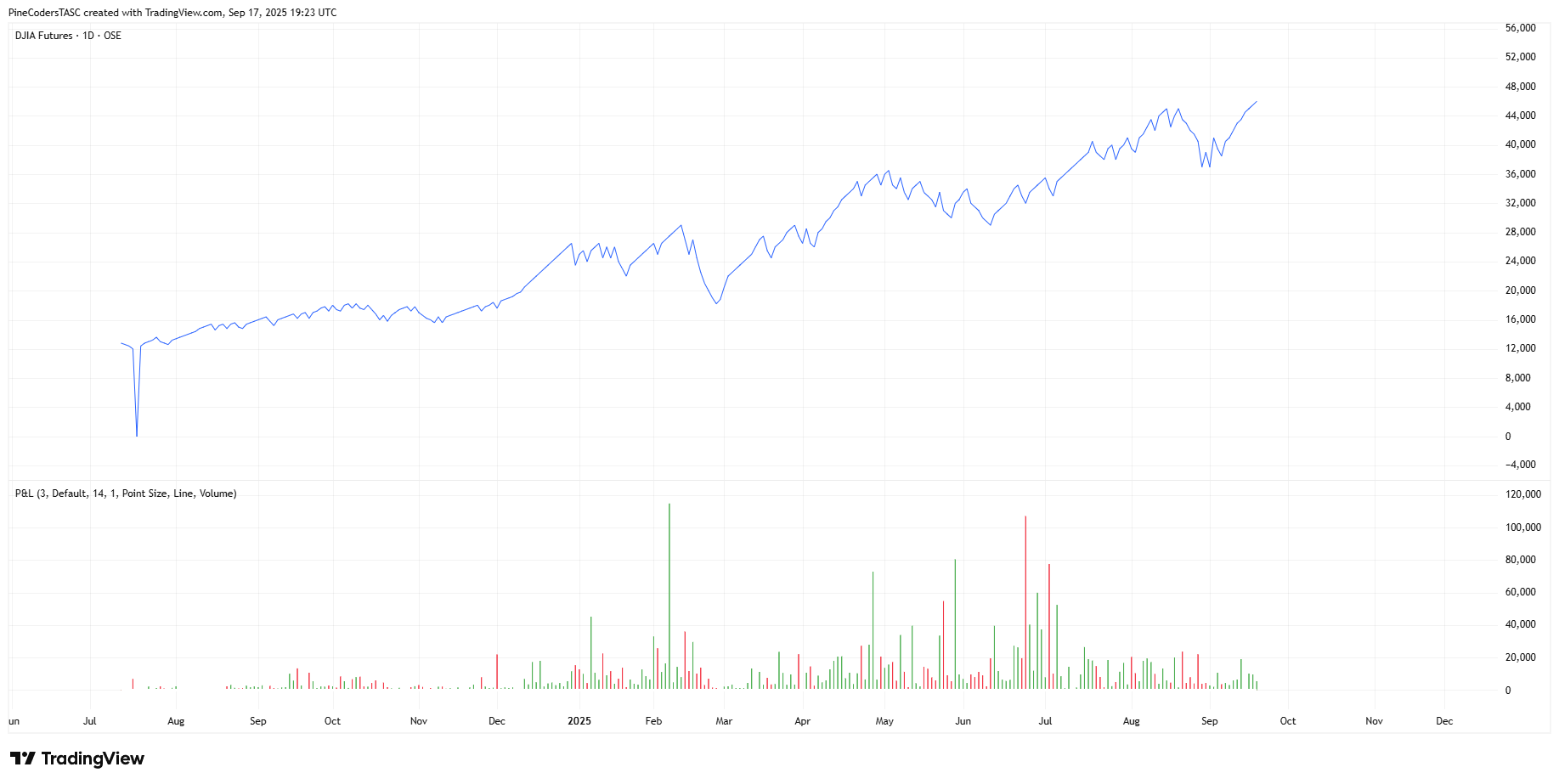
FIGURE 4: TRADINGVIEW. Shown is an example of a points & line chart in TradingView of Dow Jones Industrial Average futures.
—PineCoders, for TradingView
www.TradingView.com
BACK TO LIST

Neuroshell Trader: November 2025
The points & line chart, as described and introduced in Mohamed Ashraf and Mohamed Meregy’s article in this issue, “The Points & Line Chart,” can be easily implemented in NeuroShell Trader using NeuroShell Trader’s ability to call external dynamic linked libraries (DLLs). DLLs can be written in C, C++, or Power Basic.
After moving the code given in the article to your preferred compiler and creating a DLL, you can insert the resulting indicator(s) as follows:
- Select “New Indicator ...” from the Insert menu.
- Choose the External Program & Library Calls category.
- Select the appropriate External DLL Call indicator.
- Set up the parameters to match your DLL.
- Select the finished button.
An example chart is shown in Figure 5.
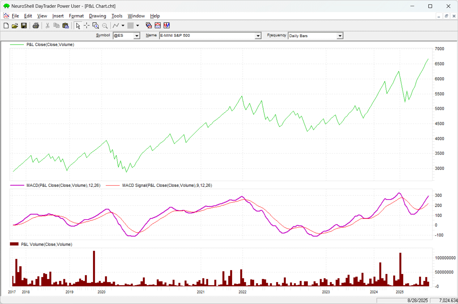
FIGURE 5: NEUROSHELL TRADER. This shows an example points & line (P&L) chart in NeuroShell Trader with MACD and volume.
Users of NeuroShell Trader can go to the Stocks & Commodities section of the NeuroShell Trader free technical support website to download a copy of this or any previous Traders’ Tips.
—Ward Systems Group, Inc.
sales@wardsystems.com
www.neuroshell.com
BACK TO LIST

The Zorro Project: November 2025
In my experience, some traders seem to like having special bars on a chart since that lets the price curve appear smoother and more predictable than it really is. Some types of bars, such as renko bars, even use artificially generated prices for producing curves that appear to move straight upward or downward.
In their article in this issue, “The Points & Line Chart,” Mohamed Ashraf and Mohamed Meregy present a chart style that avoids this problem. At least in the standard variant, the prices in the chart are real, and can be used with indicators.
The AmiBroker code in the article is lengthy and looks not as straightforward as I’d like. Fortunately, Zorro supports special bars natively, which makes such programming tasks shorter and easier. Rather than trying to work directly with and converting the AmiBroker formula language provided in the article, I instead took the route of asking an AI bot for help with the conversion. Here is the prompt I used:
Dear Chad, please convert the AmiBroker code in this PDF to C for Zorro. Use the bar function for user-defined bars on https://zorro-project.com/manual/en/bar.htm. Generate a DJIA chart with MACD and MACDSignal. For good code, you’ll get $100.
(The $100 reward, in my experience, often improves Chad’s code. In the past, I’d use the command, “Write good code or I break all your bones” and it used to work even better, but not anymore since ChatGPT 5.0 came out).
After about 3 minutes, Chad produced an almost perfect lite-C script. I only cleaned it up in a few places. I used different colors for the MACD, and I added a “g” to the names of global and static variables since this is my custom. The code is shown below.
//////////////////////////////////////////////////////////
// PointsLine.c — Zorro C port of "Points & Line" chart
// Ashraf & Meregy, TASC Traders' Tips
// Conversion P. Volkova & ChatGPT 5.0
//////////////////////////////////////////////////////////
// Modes
#define SCALE_DEFAULT   0
#define SCALE_ATR   1
#define SCALE_PERCENT   2
#define M_POINTSIZE  0
#define M_HIGHLOW   1
#define M_CLOSE   2

// User parameters
int  gReverse = 3;         // boxes needed to reverse
int  gScale = SCALE_DEFAULT; // 0=Default, 1=ATR(14), 2=Percent
int  gMethod = M_CLOSE;       // 0=PointSize, 1=HighLow, 2=Close
var  gPercent = 1.0;      // % for SCALE_PERCENT

// Compute "box size"
var box(var Price)
{
	if(gScale == SCALE_DEFAULT) {
#define RNG(X,Y) if(Price < X) return Y
		RNG(0.25,0.025);
		RNG(0.5,0.05);
		RNG(1,0.1);
		RNG(5,0.25);
		RNG(20,0.5);
		RNG(100,1);
		RNG(200,2);
		RNG(500,5);
		RNG(1000,10);
		RNG(2000,20);
		RNG(5000,50);
		RNG(10000,100);
		RNG(20000,200);
		return 500;
	}
	if(gScale = SCALE_ATR)
		return ATR(14);
	else // SCALE_PERCENT
		return Price*gPercent/100;
}

// User-defined bars
function bar(var *Open, var *High, var *Low, var *Close)
{
	var C = Close[0], H = High[0], L = Low[0];
	static int gDir = -1; // initially down
	static var gCF = C, gCR = C, gLF = C, gHR = C;

// box size
	var Box = fix0(box(C));
	var CF = ceil(C/Box)*Box,
		CR = floor(C/Box)*Box,
		LF = ceil(L/Box)*Box,
		HR = floor(H/Box)*Box;

	Switch (gMethod)
	{
		case M_POINTSIZE:
			if(CF < gCF && gDir < 0) { // continue down, new box
				gCR = CF - Box; gCF = CF;
				Close[0] = CF; return 1;
			}
			if(gCF + Box*gReverse <= CR && gDir < 0) {
				gCR = CR; gCF = CR + Box;
				Close[0] = CR; gDir = 1; return 1; // swap direction
			}
			if(gCR < CR && gDir > 0) { // continue up
				gCR = CR; gCF = CR + Box; Close[0] = CR; return 1;
			}
			if(gCR - Box*gReverse >= CF && gDir > 0) {
				gCF = CF; gCR = CF - Box; Close[0] = CF;
				gDir = -1; return 1;
			}
			break;

		case M_HIGHLOW:
			if(LF < gLF && gDir < 0) {
				gHR = LF - Box; gLF = LF;
				Close[0] = L; return 1;
			}
			if(gLF + Box*gReverse <= HR && gDir < 0) {
				gHR = HR; gLF = HR + Box;
				Close[0] = H; gDir = 1; return 1;
			}
			if(gHR < HR && gDir > 0) {
				gHR = HR; gLF = HR + Box;
				Close[0] = H; return 1;
			}
			if(gHR - Box*gReverse >= LF && gDir > 0) {
				gLF = LF; gHR = LF - Box;
				Close[0] = L; gDir = -1; return 1;
			}
			break;

		case M_CLOSE:
			if(CF < gCF && gDir < 0) { // continue down
				gCR = CF-Box; gCF = CF;
				return 1;
			}
			if(gCF+Box*gReverse <= CR && gDir < 0) { // go up
				gCR = CR; gCF = CR+Box;
				gDir = 1; return 1;
			}
			if(gCR < CR && gDir > 0) {
				gCR = CR; gCF = CR+Box;
				return 1;
			}
			if(gCR-Box*gReverse >= CF && gDir > 0) {
				gCF = CF; gCR = CF-Box;
				gDir = -1; return 1;
			}
			break;
	}
	return 4; // keep bar open, call again on next tick
}
The bar function establishes special, event-driven bars instead of the usual time bars. The function evaluates the current and previous candle, can modify the current candle if needed, and returns “1” for the beginning of a new bar or “4” for continuing with the current bar. This way, all imaginable sorts of bars can be generated—in backtests as well as in live trading.
Since AmiBroker cannot apply standard indicators on a chart with special bars, the authors had to export the chart created from AmiBroker, then import it as a symbol into MetaStock for using indicators with it. Fortunately, the Zorro platform doesn’t differentiate between standard and special bars so the user can apply indicators directly to the chart in the Zorro platform, making it much easier to use in live trading. The run function looks as it usually does.
function run()
{
	set(PLOTNOW,TICKS);
	BarPeriod = 1440;
	LookBack  = 120;
	StartDate = 2017;
	EndDate = 2025;
	BarZone = EST;
	assetAdd("DJIA","STOOQ:^DJI");
	asset("DJIA");
	plot("MACD",MACDFix(seriesC(),14),NEW,RED);
	plot("Signal",rMACDSignal,0,GREY);
}
The function uses STOOQ as a price source and plots the MACD indicator (red) and its signal line (gray).
The chart in Figure 6 replicates the chart of the Dow Jones Industrial Average (DJIA) shown in Ashraf and Meregy’s article in this issue. Due to the variable length of bars, the time scale on the x-axis is uneven; the DJIA moved a lot more in the years 2020 and 2022 than in the other years.
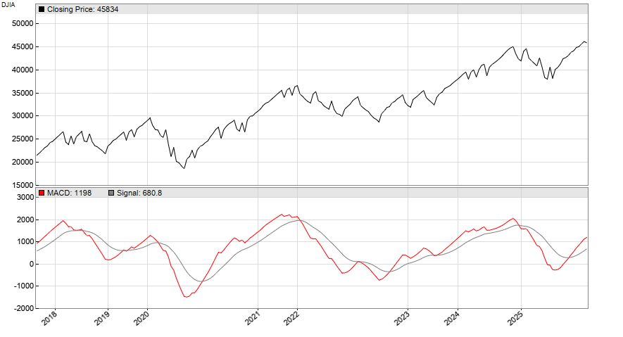
FIGURE 6: ZORRO. Here is an example of a points & line chart in Zorro of the Dow Jones Industrial Average (DJIA) that is similar to the chart shown in the referenced article in this issue. As an example of applying indicators to this style of chart, the MACD indicator is shown in red and its signal line is seen as the gray line.
The code can be downloaded from the 2025 script repository on https://financial-hacker.com. The Zorro platform can be downloaded from https://zorro-project.com.
—Petra Volkova
The Zorro Project by oP group Germany
https://zorro-project.com
BACK TO LIST
Python: November 2025
I am providing a Python implementation of the charting style described in the article in this issue by Mohamed Ashraf and Mohamed Meregy titled “Points & Line Chart.”
Three Python functions are provided to implement the points & line (P&L) calculations and to generate the P&L chart style. (See Figure 7 for a sample chart.)
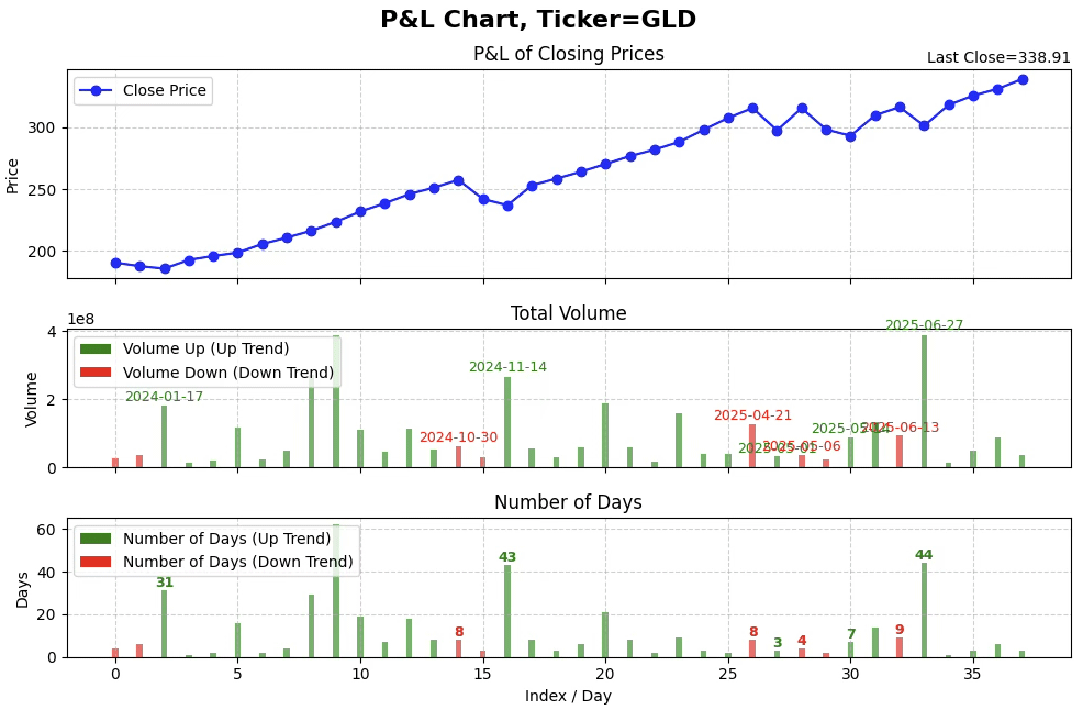
FIGURE 7: PYTHON. Shown here is an example points & line chart of the ETF GLD, using Python to create it. Total volume bars are plotted in the middle pane, and bars representing the number of days is plotted in the bottom pane.
The plotting function is designed to highlight the P&L price reversals (that is, swing points). When enabled, the date of the reversal will be overlaid on the associated volume bar and the number of days of the reversal move will be overlaid on the associated number of days bar.
I am providing two usage examples:
- An example using sample data (from the article) to verify the P&L calculations
- Implementation of a P&L chart for the ETF GLD from 2024 to present.
I will code example 1, while a Jupyter notebook will contain both examples 1 and 2. An example Jupyter notebook can be downloaded from: https://github.com/jainraje/TraderTipArticles/blob/main/nov_2025_point_and_line_chart_final.ipynb
"""

# import required python libraries
%matplotlib inline

import yfinance as yf
import pandas as pd
import numpy as np
import math
import datetime as dt
import matplotlib.pyplot as plt
from matplotlib.patches import Patch

print(yf.__version__)# import required python libraries
%matplotlib inline

import pandas as pd
import numpy as np
import math
import datetime as dt
import yfinance as yf

print(yf.__version__)

0.2.58


def calc_point_size(price):
    """
    This function determines the point size based on provided price value.

    Parameters:
    price (float): price value.

    Returns:
    (float): point size matching look up table in article.
    """

    if 0 <= price <= 0.25:
        return 0.025
    elif 0.25 < price <= 1:
        return 0.05
    elif 1 < price <= 5:
        return 0.25
    elif 5 < price <= 20:
        return 0.50
    elif 20 < price <= 100:
        return 1
    elif 100 < price <= 200:
        return 2
    elif 200 < price <= 500:
        return 5
    elif 500 < price <= 1000:
        return 10
    elif 1000 < price <= 2000:
        return 20
    elif 2000 < price <= 5000:
        return 50
    elif 5000 < price <= 10000:
        return 100
    elif 10000 < price <= 20000:
        return 200
    else:
        return np.nan


def calc_point_and_line(data, reshape=True):
    """
    This function performs all the P&L calculations.

    Parameters:
    data (dataframe): dataframe must contain at minium the following
    4 columns named: 'Date', 'Close', 'Volume', 'Symbol'.

    Returns:
    (dataframe): dataframe with 'P&L Close', 'Total Volume', 'Number of Days'
    """

    df = data.reset_index().copy()
    reversal_size = 3

    # make sure the column exists
    df["Plot"] = ""
    df["Total Volume"] = np.nan
    df["Direction"] = 0

    for i in range(len(df)):
        value = df.iloc[i]['Close']
        volume = df.iloc[i]['Volume']
        point_size = calc_point_size(value)

        if i == 0:
            last_level = value
            last_index = i
            df.at[df.index[i], 'Plot'] = "Yes"
            direction = 0
            volume_total = volume
            num_days = 1

        else:
            if direction == 1:
                if (value >= last_level + point_size) or (value <= last_level - reversal_size*point_size):
                    if value <= last_level - reversal_size*point_size:
                        direction = -1

                    df.at[df.index[last_index], "Total Volume"] = volume_total
                    df.at[df.index[last_index], "Number of Days"] = num_days
                    df.at[df.index[last_index], "Direction"] = direction
                    df.at[df.index[i], "Plot"] = "Yes"
                    last_level = value
                    last_index = i
                    volume_total = volume
                    num_days = 1

                else:
                    volume_total += volume
                    num_days += 1

            elif direction == -1:
                if (value <= last_level - point_size) or (value >= last_level + reversal_size*point_size):
                    if value >= last_level + reversal_size*point_size:
                        direction = 1

                    df.at[df.index[last_index], "Total Volume"] = volume_total
                    df.at[df.index[last_index], "Number of Days"] = num_days
                    df.at[df.index[last_index], "Direction"] = direction
                    df.at[df.index[i], "Plot"] = "Yes"
                    last_level = value
                    last_index = i
                    volume_total = volume
                    num_days = 1

                else:
                    volume_total += volume
                    num_days += 1

            else:  # direction == 0
                if (value >= last_level + point_size) or (value <= last_level - point_size):
                    direction = 1 if value >= last_level + point_size else -1

                    df.at[df.index[last_index], "Total Volume"] = volume_total
                    df.at[df.index[last_index], "Number of Days"] = num_days
                    df.at[df.index[last_index], "Direction"] = direction
                    df.at[df.index[i], "Plot"] = "Yes"
                    last_level = value
                    last_index = i
                    volume_total = volume
                    num_days = 1

                else:
                    volume_total += volume
                    num_days += 1

    # after the loop, finalize the last segment
    df.at[df.index[last_index], "Total Volume"] = volume_total
    df.at[df.index[last_index], "Number of Days"] = num_days
    df.at[df.index[last_index], "Direction"] = direction

    if reshape:
        cols = ['Close', 'Total Volume', 'Number of Days']
        cond = df['Plot']=='Yes'
        df = df[cond].reset_index(drop=True)

    df['Date'] = df['Date'].astype(str)

    cond_swing_high = (df['Close'].shift(2) < df['Close'].shift(1)) & (df['Close'].shift() > df['Close'])
    df['Swing High'] = np.where(cond_swing_high, df['Date'].shift(), '')

    cond_swing_low = (df['Close'].shift(2) > df['Close'].shift(1)) & (df['Close'].shift() < df['Close'])
    df['Swing Low'] = np.where(cond_swing_low, df['Date'].shift(), '')

    df['Swing High'] = df['Swing High'].shift(-1)
    df['Swing Low'] = df['Swing Low'].shift(-1)

    df.at[df.index[-1], "Swing High"] = ''
    df.at[df.index[-1], "Swing Low"] = ''


    return df


def plot_point_line_chart(df, display_sp=False, display_nd=False):
    """
    This function will plot the Point and Line Chart with 3 subplots:
    1) P&L Price
    2) Total Volume
    3) Number of Days

    Parameters:
    df (dataframe): dataframe containing the P&L calculations (ie output
                    of the P&L calcilation routine)
    display_sp (BOOL) : True or False toggle to enable/disable Swing Point
                        date over-lay on swing point volume bars
    display_nd (BOOL): True or False toggle to enable/disable number
                       of days over-lay on swing point day bars

    Returns:
    No return
    """

    bar_width = 0.25

    fig, axes = plt.subplots(3, 1, figsize=(10, 7), sharex=True, gridspec_kw={'height_ratios':[3,2,2]})

    # --- Overall Figure Title ---
    ticker = df.iloc[0]['Symbol']
    fig.suptitle(f"P&L Chart, Ticker={ticker}", fontsize=16, fontweight='bold', y=0.95)

    # --- Closing Prices ---
    axes[0].plot(df.index, df['Close'], marker='o', linestyle='-', color='blue', label='Close Price')
    axes[0].set_title("P&L of Closing Prices")
    axes[0].set_ylabel("Price")
    axes[0].legend(loc="upper left")
    axes[0].grid(True, which='major', linestyle='--', alpha=0.6)


    # --- Add note to upper-right of the price subplot title ---
    note_text = f"Last Close={df.iloc[-1]['Close'].round(2)}"
    axes[0].text(1.0, 1.02, note_text, transform=axes[0].transAxes,
                 ha='right', va='bottom', fontsize=10, fontweight='regular', color='black')

    # --- Volume colors based on Direction ---
    volume_colors = ['green' if d==1 else 'red' for d in df['Direction']]

    # --- Total Volume ---
    axes[1].bar(df.index, df['Total Volume'], color=volume_colors, alpha=0.6, width=bar_width)
    axes[1].set_title("Total Volume")
    axes[1].set_ylabel("Volume")
    axes[1].grid(True, which='major', linestyle='--', alpha=0.6)

    # --- Annotate Swing High and Swing Low above Volume bars ---
    if display_sp:
        for idx, row in df.iterrows():
            volume_top = row['Total Volume']
            if pd.notna(row['Swing High']):
                axes[1].text(idx, volume_top + volume_top*0.02, f"{row['Swing High']}", color='red', fontsize=9,
                             ha='center', va='bottom', fontweight='regular')
            if pd.notna(row['Swing Low']):
                axes[1].text(idx, volume_top + volume_top*0.02, f"{row['Swing Low']}", color='green', fontsize=9,
                             ha='center', va='bottom', fontweight='regular')

    # --- Add legend for Volume colors ---
    volume_legend = [Patch(facecolor='green', label='Volume Up (Up Trend)'),
                     Patch(facecolor='red', label='Volume Down (Down Trend)')]
    axes[1].legend(handles=volume_legend, loc='upper left')

    # --- Number of Days (track Volume colors) ---
    axes[2].bar(df.index, df['Number of Days'], color=volume_colors, width=bar_width, alpha=0.6, label='Number of Days')
    axes[2].set_title("Number of Days")
    axes[2].set_ylabel("Days")
    axes[2].set_xlabel("Index / Day")
    axes[2].legend(loc="upper left")
    axes[2].grid(True, which='major', linestyle='--', alpha=0.6)

    # --- Annotate Number of Days only where Swing High/Low exists ---
    for idx, row in df.iterrows():
        # Swing High case
        if pd.notna(row['Swing High']) and row['Swing High'] != '':
            axes[2].text(idx, row['Number of Days'] + 0.1,
                         f"{int(row['Number of Days'])}",
                         ha='center', va='bottom', fontsize=9,
                         fontweight='bold', color='red')
        # Swing Low case
        if pd.notna(row['Swing Low']) and row['Swing Low'] != '':
            axes[2].text(idx, row['Number of Days'] + 0.1,
                         f"{int(row['Number of Days'])}",
                         ha='center', va='bottom', fontsize=9,
                         fontweight='bold', color='green')

    # --- Add legend for Number of Days colors ---
    volume_legend = [Patch(facecolor='green', label='Number of Days (Up Trend)'),
                     Patch(facecolor='red', label='Number of Days (Down Trend)')]
    axes[2].legend(handles=volume_legend, loc='upper left')

    plt.tight_layout(rect=[0, 0, 1, 0.95])
    plt.show()

"""
Example usage

"""
# Use Yahoo Finance python package to obtain OHLCV data for desired ticker

#ticker = '^GSPC'
ticker = 'GLD'

ohlcv = yf.download(
    ticker,
    start="2019-01-01",
    end="2025-09-18",
    #group_by="Ticker",
    auto_adjust=True,
    multi_level_index=False,
    progress=False,
)
ohlcv['Symbol']=ticker
ohlcv

# Simple line plot of daily close. Using slicing to plot desired start
# and end timeframe.

ax = ohlcv['2024':'2025'][['Close']].plot(figsize=(10, 3), grid=True, title=f'Daily Close, Ticker={ticker}')


# Execute P&L calculations and plot the P&L Chart. Using slicing technique
# plot desired start and end time frames. Note how P&L swing points dates
# are over-laid on the volume bar and the number of days for the move are
# over laided on the number of day bars.

df = calc_point_and_line(ohlcv['2024':'2025'].reset_index(), reshape=True)
plot_point_line_chart(
    df,
    display_sp=True, # toggle to enable/disable swing point overlay
    display_nd=True, # toggle to enable.disable number of day overlay
)
—Rajeev Jain
jainraje@yahoo.com
BACK TO LIST
Originally published in the November 2025 issue of
Technical Analysis of STOCKS & COMMODITIES magazine.
All rights reserved. © Copyright 2025, Technical Analysis, Inc.