QUANTITATIVE METHODS
Striking Analogies
Unraveling The Mystery Of Stock Prices
Here’s a simple method you can apply to interpret financial charts. It uses classical statistics as well as a number of simple chart indicators, which may help you better understand classical charts from the viewpoint of random processes.
Every trader is familiar with stock charts. To most traders the chart is just a common tool, like a hammer is to the carpenter. The exception is the new trader reading charts for the first time or the advanced trader who begins to question the value of the charts he or she watches.
Financial charting is specific. There are many exotic charts common to most modern trading platforms. You may begin with the classical bar charts or candlesticks and continue on to Equivolume, kagi, renko, and others. Add to that numerous technical indicators and strategy signals, and you have something packed full with useful information.
You want to concentrate as much useful information as possible into the chart so you can make timely trading decisions. To the newbie trader, this may appear to be confusing and artificial. To the seasoned professional, trying to determine what information is truly valuable for profitable trading is a vital concern.
Although financial charts can be vivid and attractive, they do tend to have contradictions with modern statistics. The charts can introduce dubious and unstable measures, which in turn become the basis of popular trading strategies. This could increase the risk of your trading operations.
In this article, I will identify the shortcomings of typical charting from a simple mathematical viewpoint and offer some easy indicators and techniques that you can apply to unravel the mystery of common charting data.
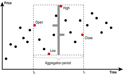
Figure 1: RAW DATA AGGREGATION. The rectangle covers all the price points within the given aggregation range. The base of the rectangle equals the aggregation period and it is vertically delimited by the minimum and maximum price value over that time period. The four border points represent the open, high, low, and close.