CHARTING
Is It Harder To Make Money These Days?
Do Chart Patterns Still Work?
Has the failure rate of chart patterns increased in recent years?
In the last several years, have you found it more difficult to make money in the stock market? Do you get the feeling that indicators are less effective than they used to be in spotting profitable opportunities? I decided to find the answers to those questions with a new study. I spent a week updating a database of chart patterns that I used during research for writing my books, and found an alarming result.
In my investigation, I used 13,932 chart patterns spread over the years from 1991 to 2008. I did not use all of the chart pattern types in my analysis but concentrated on 23 of the most common and popular. They are: diamond tops and bottoms; double tops and bottoms (eight types of Adam and Eve combinations); triple tops and bottoms; rising and falling wedges; head & shoulders tops and bottoms (four types of simple and complex); ascending, descending, and symmetrical triangles; and rectangle tops and bottoms.
Excluded were broadening patterns (six types) and scallops (four types) because of the difficulty in determining where the breakout is. Horns and pipes also did not make the cut because they perform best on the weekly scale. I only tested chart patterns using daily price data. The plethora of patterns means that when separated into years, there were an average of 425 samples per year, and I wanted to keep the sample counts as high as possible for a statistically meaningful result.
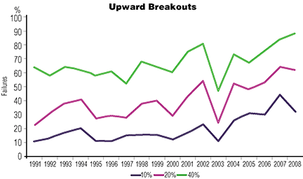
Figure 1: upward breakouts. Here you see three failure rates from chart patterns with upward breakouts. Note the upward trend over the years. Failures in 1991 were a third of what they were in 2007. Trading chart patterns and making a profit has become substantially more difficult.
Upward breakouts
I split the data into two types of patterns, those with upward breakouts and those with downward ones. Figure 1 shows three failure rates from chart patterns with upward breakouts.
I calculated the rise using the closing price from the day before the breakout (to include breakout day gaps) to the ultimate high, which is the highest peak before price dropped by at least 20% (signifying a trend change), or closed below the bottom of the chart pattern. Then I counted the number of patterns that failed to show post-breakout rises of 10%, 20%, and 40% before the trend changed.