INDICATORS
Visual, Digital Candlesticks
Trading With The Heikin-Ashi Candlestick Oscillator
This visual tool complements candlesticks that will help you enter and exit trades, resulting in higher profits per trade.
Analyzing a candlestick chart gives a good idea of what is going on in the market. Candlestick patterns, resistance or support from price pivots, rising or falling windows, and the use of trendlines are all excellent technical trading tools. But initiating a trade and deciding when to close it, candle after candle, remains a difficult task. It would be nice to have a complementary visual aid when looking at a candle chart.
Figure 1, a daily chart for Ford Motor Co., uses an expert function for color-coding the candlesticks. On November 21, 2006, the price falls through the uptrend line after a number of green candles. This means it’s time to close any long position and open a new short position. As long as there are red candles, we will keep the short trade open. On December 20, 2006, there is a new green candle. Drawing a downtrend line up to this point, we see that it is broken to the upside. It’s time to close the short position and open a new long position.
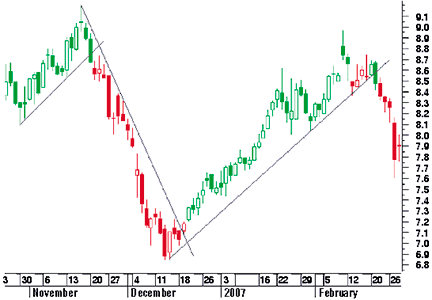
FIGURE 1: color-coded candlesticks. A short trade can be opened when price falls through the uptrend line. The short trade is open till the downtrend line is broken to the upside.
On February 13, 2007, we have a first red candle. Drawing the uptrend line, we see that the closing price remains above the uptrend line. As a rule, we will wait for the next day. The price continues above the trendline and the candles are turning green again. On February 22, 2007, there is another red candle. Now, the uptrend line is broken, so we close the long position eventually, opening a new short position. The color-coded candlesticks make daily followup easy and relaxing. Want to know how this is done? Of course you do.
The Starting Idea
A good starting point is the heikin-ashi chart. In the daily chart of Sysco Corp. in Figure 2, you can see the traditional candlestick chart on the top and the heikin-ashi chart on the bottom. Visually, the heikin-ashi candles look very consistent. In a downtrend, we see mostly black candles with no or small upper shadows. In an uptrend, there are mostly white candles with no or small lower shadows.