In The Search For Profitable Trading
Chart Your Stocks With Float Charts
by Steve Woods
Price is king. Volume is queen. Both live in the context of time. But is there a prince or prime minister who has been overlooked? Float charts may have the answer.
IN my 1996 STOCKS & COMMODITIES article, I introduced the cumulative volume float indicator and demonstrated a dynamic relationship between a stock's price and volume and its floating supply of shares. The idea was simple: by adding up volume cumulatively on a chart, we can identify rectangles that correspond with areas of accumulation at the bottom and distribution at the top. Since then, I have come to realize that what I discovered was not just a new indicator but an entirely new type of stock chart.
To understand, consider this question: What data goes into creating a stock chart? Price and volume. Is there a piece of data that stock charts have not been using? If the historical pantheon of charting begins with candlesticks, then goes to point and figure, then moves on to price & volume, I would ask: Is there a fourth way of charting stocks? Is there an overlooked piece of data which, when used properly, actually creates a new type of stock chart? Is there a new way to look at what is happening in a stock's trading history? Yes! The missing data is the float number. The new type of chart is a float chart, and its origins go back to W.D. Gann's book, Truth Of The Stock Tape, originally published in 1923.
DEFINING TERMS
To explain what float charts are, I will first define four key terms: float, float turnover, float boxes, and float channel lines. Then I will present a float chart example and clarify how these new charts are created as well as demonstrate how I make money using them.
The term float refers to the number of shares actually available for trading. When a company goes public, they issue shares outstanding. The management then holds some percentage of shares and what's left over to be sold to the public is referred to as the float or floating supply. Float charts are all about tracking the floating supply in an attempt to find areas of accumulation and distribution on a chart due to a change in the ownership of the floating supply.
I coined the term float turnover. It refers to any time frame on the chart in which the cumulative volume equals the number of shares in the floating supply. Float turnovers are shown on the chart as a yellow rectangle with two red lines. The rectangle changes from day to day like a moving average and is known as the float turnover box or, more simply, the float box.
The upper and lower right-hand corners of the float box get plotted on a day-to-day basis, thereby creating float channel lines. These channel lines allow us to see the "tracks" left behind from previous float turnover boxes. By creating float boxes from half or a quarter of the floating supply, we get narrower channel lines within the larger 100% float box channel lines. These narrower lines, known as the 50% and 25% float channel lines, show where stocks have a tendency to find support at the bottom of corrections and resistance at the top of retracements.
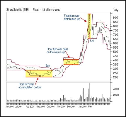
FIGURE 1: FLOAT BOXES. These help you identify where accumulation occurred, where distribution took place, and where the float changed hands.
Excerpted from an article originally published in the November 2005 issue of Technical Analysis of STOCKS & COMMODITIES magazine. All rights reserved. © Copyright 2005, Technical Analysis, Inc.
Return to November 2005 Contents