TRADING TECHNIQUES
MetaTrends
by R.G. Boomers
Just when you thought you'd seen everything in charting,
alongcomes a new idea.
Many of the tools of technical analysis are based on an interval of time. The question that always gets asked concerning such tools is, "What is the best interval?" So what is it? All intervals! That's right, use 'em all! At the same time! The technique is known as MetaTrends, and I'll show you how they are formed.
THE TECHNIQUE
First, plot an ordinary graph of stock prices. For my purposes here, I use the Dow Jones Industrial Average (DJIA) from 1924, but you could use any time period.
Next, below the bottom of the graph directly under the first datapoint, place some color based on whether the shortest interval under consideration is going up or down. Use shades of green for degrees of uptrend and shades of red for degrees of downtrend - that is, the steeper the trend, the brighter the shading of color. If, for example, the one-bar interval is down, put a point of red there.
Next, increase the interval to, say, two bars, determine whether the DJIA is going up or down for that interval, and place the appropriate color directly below the first point of color. Keep increasing the interval and placing the appropriate color directly below the last until you run out of computer screen.
After that, move from the first datapoint of the graph to the second
datapoint and plot the colors for each interval just the way you did for
the first datapoint. Do the same for each datapoint of the graph. A graph
very similar to Figure 1 will be the result. Pretty, isn't it? But where
are the MetaTrends? Is this chart good for anything? These are good questions.
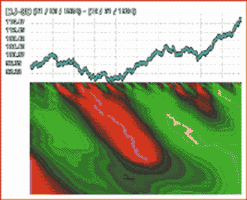
FIGURE 1: METATRENDS CHART. Plotting all the past periods' trends in color produces a visual picture of their ebb and flow. Red is bearish, green bullish.
Once you're done, the MetaTrends are easy to identify. The colors green and red representing, respectively, uptrends and downtrends, group together. They do not occur randomly. Each grouping of the same color is a MetaTrend.
To begin to understand the usefulness of MetaTrends, look at Figure 2. On this chart, we see two sets of parallel double-headed arrows connected by horizontal cross lines. The set labeled "1" points out the beginning and ending of a downward MetaTrend. At the beginning of this MetaTrend, the DJIA is going down. At the end of the negative MetaTrend, the DJIA is going up. This is typical negative MetaTrend behavior.
The set labeled "2" points out the beginning and ending of a small positive MetaTrend. Note at the beginning of the positive MetaTrend, the DJIA is going up. At the end of the positive MetaTrend, the DJIA is going down. This is typical positive MetaTrend behavior.
USE
The first and most obvious use of MetaTrends is determining the overall trend of the stock/index being analyzed. If the background color of the chart is green, the overall trend is up. If the background color is red, the trend is down.
The background color is the predominant color on the right side of the chart. Bear in mind, there are only two colors on the chart (red and green). Yellow is merely the brightest green; purple merely the brightest red. If there is more red than green on the right side of the chart, the predominant color is red. If there is more green than red on the right side of the chart, the predominant color is green. Suppose you were looking at a woman's dress with various colors of polka dots, but one color was covering more surface area. That color is the background color.
R.G. Boomers is a stock market behaviorist residing in a remote, rural, largely unpopulated and unexplored portion
of darkest Arkansas. He can be reached at rgboomers@yahoo.com
Excerpted from an article originally published in the June 2001 issue of Technical Analysis of STOCKS & COMMODITIES magazine. All rights reserved. © Copyright 2001, Technical Analysis, Inc.
Return to June 2001 Contents