NEW TECHNIQUES
A High-Tech Search Technique
Phasor Displays
by John F. Ehlers
A high-tech display pinpoints anomalies and trading opportunities in price behavior.
Remember that famous glass of water? The one that optimists see as half full and pessimists see as half empty? An engineer, however, sees the glass as having been designed with too much capacity. So what we see is really a matter of perception.
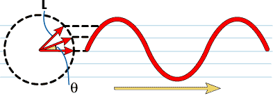
FIGURE 1: THE PHASOR. A phasor is the arrow from the center of the circle to the circle itself. That arrow rotates clockwise around the circle. The tip is tracked by marking on a steadily moving piece of paper underneath as it goes around the circle. The result is the wave seen to the right of the circle. Pictorially, this is the classic formulation of a sinewave, the model for cyclical waves in prices.
Market technicians have designed a variety of techniques to visualize what
has happened and to predict what the future holds. Candlestick charts and
point and figure charts are two examples of charting price data. When it
comes to indicators, there is a plethora of wiggles, squiggles, zigzags,
and channels that require volumes to describe.
I would now like to add to this din of displays a new and novel one so sensitive that it dramatically pinpoints variations and anomalies that cannot be removed with mathematical filters -- at least within the lag constraints imposed by trading considerations.
PHASORS
One easy way to picture a cycle is as a phasor (Figure 1). The phasor is fixed at the tail of the arrow and rotates. Each time the arrowhead sweeps through one complete rotation, a cycle is completed. If we place a pen on the arrowhead and draw a sheet of paper below the arrowhead at a uniform rate as is done for seismographs, the pen draws a theoretical sinewave as shown at the right of the phasor. The relationship between the phasor diagram and the theoretical sinewave yields the typical cycle waveform we recognize on our charts. The phase angle of the arrow (its rotation angle from zero degrees) uniquely describes where we are in the waveform.
The position of the tip of the arrow in Figure 1 can be described in terms of the length of the arrow, L, and the phase angle, theta. If we let the arrow be the hypotenuse of a right triangle, we can convert the description of the arrow from length and angle to two orthogonal (at right angles) components: the other two legs of the right triangle.
If you recall your trigonometry, the vertical component is L*Sin(theta) and the horizontal component is L*Cos(theta). The horizontal component is called the inphase component and the vertical component is called the quadrature component. The trick in creating a phasor display is generating the inphase and quadrature components. That is what a Hilbert transform does; it creates the inphase and quadrature components from the analytic waveform (Figure 2).
In the sidebar "Hilbert transform displays," I've supplied the most recent TradeStation code for the Hilbert transform, code that will export a file that Excel can use to display the phasor. (Code for other software was published in the November 2000 S&C.) Figure 3 shows a phasor display for a perfect sinewave (of, say, prices) like that in Figure 1. Of course, prices aren't always perfect sinewaves, though they sometimes come close.
John F. Ehlers, Box 1801, Goleta, CA 93116, is an electrical engineer working in electronic research and development and has been a private trader since 1978. He is a pioneer in introducing maximum entropy spectrum analysis to technical traders through his Mesa software. He may be reached at 805 969-6478, or via his Website at https://www.mesasoftware.com.
Excerpted from an article originally published in the December 2000 issue of Technical Analysis of STOCKS & COMMODITIES magazine. All rights reserved. © Copyright 2000, Technical Analysis, Inc.
Return to December 2000 Contents