QUOTE.COM'S FAST QUOTE AND LIVE! CHARTS
https://fast.quote.comQuote.com offers a range of free and paid charting services at its site. In the March 1999 STOCKS & COMMODITIES, we reviewed QCharts, the Internet-delivered real-time quote and charting service from Quote.com. But Quote.com offers packages for every level of trader, from free to $99.95 a month for the real-time QCharts service. In the free area, you can plot quick charts or live, streaming charts.
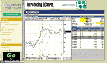
Quote.com's LIVE! chart
To begin, enter the free area at fast.quote.com and input a symbol. From the menu, select extended, delayed quotes; a quick chart; news headlines with links to stories; links to brokerage reports; company snapshots; SEC filings; LIVE! Charts; a portfolio tracker; an industry watch page; IPO listings; or an investor education center.
From this list, click on "charts" to plot quick, simple charts for delayed intraday data (in one-minute or five-minute bars), daily, weekly, or monthly delayed data. Charts plot with a moving average; no other studies are available from here. Click on LIVE! Charts to view streaming charts, which are charts that refresh tick by tick (with delayed data or, if you're paying for the real-time service, with real-time data). The streaming data is accomplished through a Java applet, using the same technology that powers Quote.com's real-time QCharts. Thus, you can get a taste for QCharts by using LIVE! Charts.
Along with streaming data, LIVE! Charts offers a dozen chart studies with adjustable parameters (plotted one at a time only), historical charting, and hotlists. The studies include moving averages, Bollinger bands, stochastics, MACD, rate of change, and Donchian channels, among others. A scrolling list shows the most recent trades. You can chart in a number of time frames, including one-minute bars. A Market Watch box shows you at a glance US market indices, or alternatively, largest gainers and losers, call or put volume, and more.
JOHN BOLLINGER'S CHARTS
www.equitytrader.comJohn Bollinger's company, Acme Analytics, offers unique charts at www.EquityTrader.com with a focus on performance ranking and sector strength. Bollinger's charts not only give you color-coded bars with volume and moving averages, but the charts are displayed with convenient tabs surrounding the chart that lets you change the display. You can display daily, weekly, or monthly data; display a time frame from between 30 days to one year; or display a basic chart, a supply/demand chart with money flow and cumulative money flow, a relative strength chart relative to the S&P, or a momentum chart with RSI and momentum.
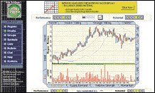
EquityTrader.com chart
EquityTrader.com's chart service seeks to provide investors with a quick and easy method of evaluating the past performance and potential appreciation of equities. EquityTrader evaluates a universe of 3,700 stocks in 141 industry groups and 13 sectors.
EquityTrader employs a fuzzy-logic engine to evaluate 54 rules to determine a stock’s "potential" rating. Both fundamental and technical factors are considered in arriving at the potential. The fuzzy logic model is unique to EquityTrader and was developed by John Bollinger, who is also well known for his Bollinger bands.
The two sets of traffic lights at the top of the chart represent the model rating and the performance ranking. Green lights mean strong potential and strong ranking. The performance is a historical view, while the potential is EquityTrader's future outlook. The set of lights at the bottom of the chart reflect the industry group reading. Click on a traffic light to get a description of some of the factors behind the rating.
One way of using this site is to go to the lists area where the universe is categorized. Viewing the lists requires registration.
QUICKEN
www.quicken.comThe maker of the popular financial software also offers a Website chock-full of financial information. You'll find news, commentary, a message board, and information on mutual funds, bonds, and options. For charting, go to the Investments department. In the Tools list, click on "Research stocks," enter a symbol, then click "Chart." A quick one-year chart pops up. You can add a moving average by selecting from a 25-day, 50-day, 100-day, or 200-day average.
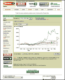
Quicken.com charts
There are no technical analysis studies available to plot and the charts only display in one size, but a strength is performance comparison, allowing you to plot up to nine symbols/indices at once. Plots are colored and labeled. The price scale is percentage price change. A nice feature is that it will help you set up a performance comparison by listing the top 10 performers in your stock’s sector. A simple check of the checkboxes takes you to a comparison chart instantly.
Charting timeframes run from intraday to five years. Quotes are provided by S&P ComStock.
Originally published in the October 1999 issue of Technical Analysis of STOCKS & COMMODITIES magazine. All rights reserved. © Copyright 1999, Technical Analysis,Inc.
Return to Table of Contents