statistics
Determining Trend Strength And Turning Points
The Spearman Indicator For Technical Analysis 
This indicator is a very old statistical tool that even to this day helps determine trend strength and turning points. Here’s how to apply it to your trading.
Technical analysis can be considered both a science and an art; patterns and chart reading represent the artistic component, while technical indicators help us analytically understand trend strength, buy/sell pressure, and divergences. There are perhaps thousands of technical indicators, but few seem to deliver real analytical power and differentiation in this increasingly crowded landscape, especially since many can be perceived simply as intellectual exercises that produce little bottom-line impact.
To narrow down this set of tools, statistics offer a great source of established knowledge for those who want to focus on more tangible and useful indicators. For instance, the tried-and-tested Z-score has become a classic in both statistics and technical analysis.
In this article we will discuss an established concept in statistics originally proposed in 1904, with potential for use in technical analysis: the Spearman’s rank correlation coefficient, also known as the Spearman indicator.
Spearman’s rank correlation coefficient
Charles Spearman was a late 19th-century and early 20th-century British psychologist and mathematician with major contributions to factor analysis, theories of intelligence, and mental test theory. In 1904, he developed a statistical measure for the strength of association between two variables. It later became the foundation of the rank correlation coefficient bearing his name. Spearman’s rank correlation coefficient computes the degree of correlation between the ranks of the elements in two data groups of equal size.
Now, let’s assume that two data groups are each composed of N elements (N = 10). The lowest-value element in each group receives the lowest ranking. Then the next-lowest element gets the second-lowest ranking, then the next, until we reach the highest element in each group that gets the highest ranking. After this exercise, we are left with the original two data groups and two additional groups containing the ranks.
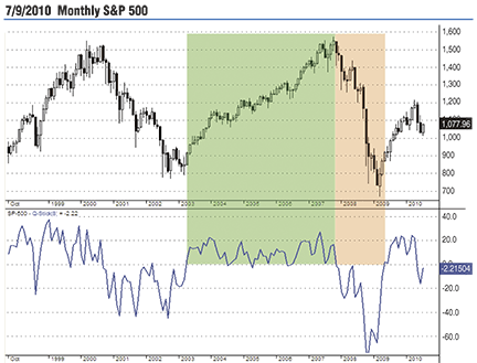
Figure 1: qstick on a monthly s&p 500 chart. Positive values confirm buying pressure as seen during the 2003–07 solid uptrend. Things changed dramatically during 2007–09 when Qstick turned negative.